Daily Creates 6: Data Visualization
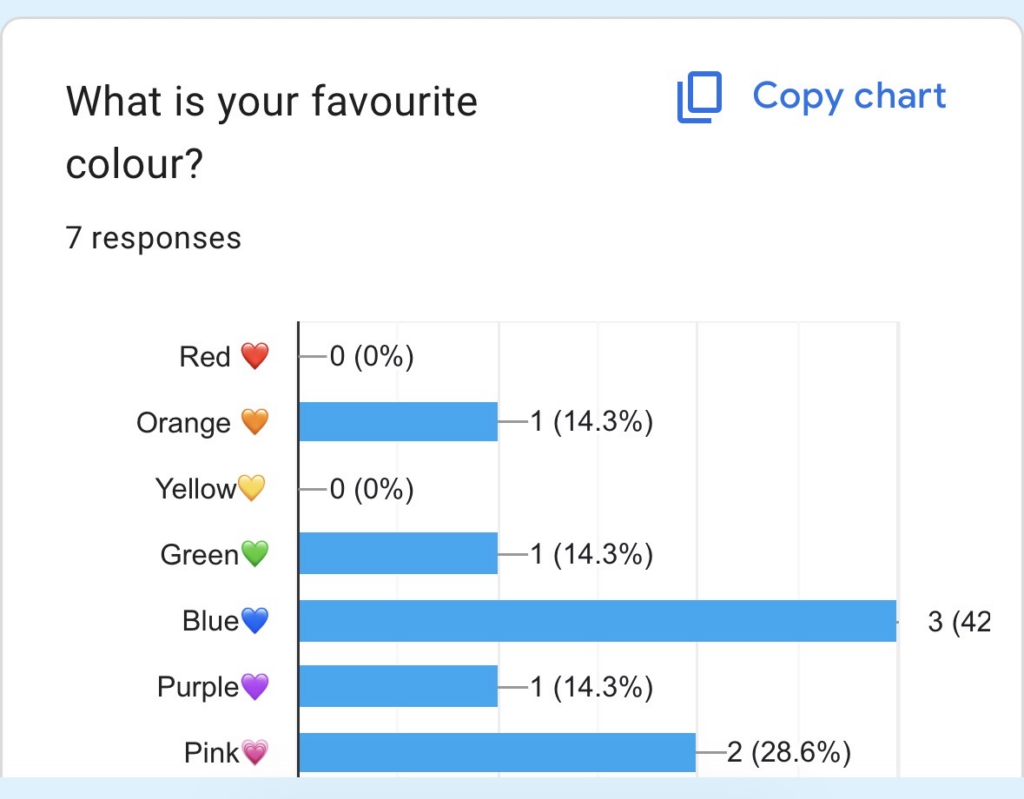
Since the daily creates did not have a section for the data visualization, I decided to create my own prompts this week. For my first prompt, I created a google form to send out to my family group chat and have them answer what their favorite color was so that I could see the most popular answer. The image below shows that blue was the most popular color.
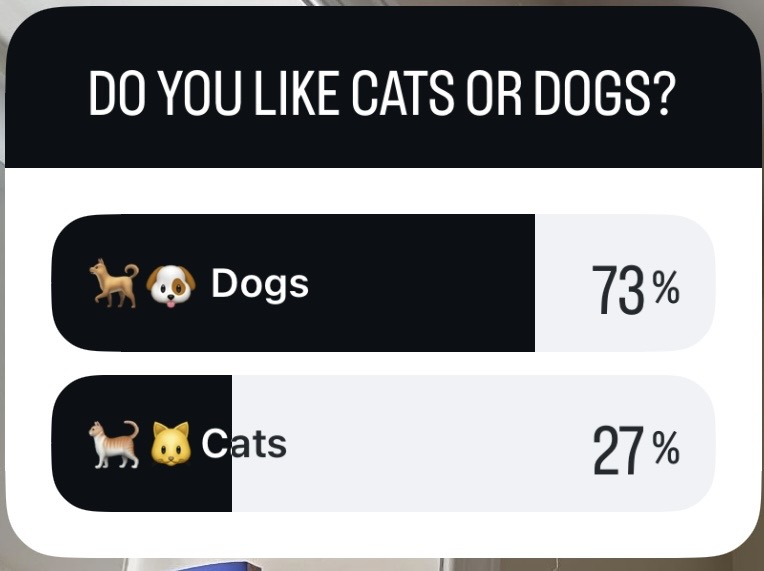
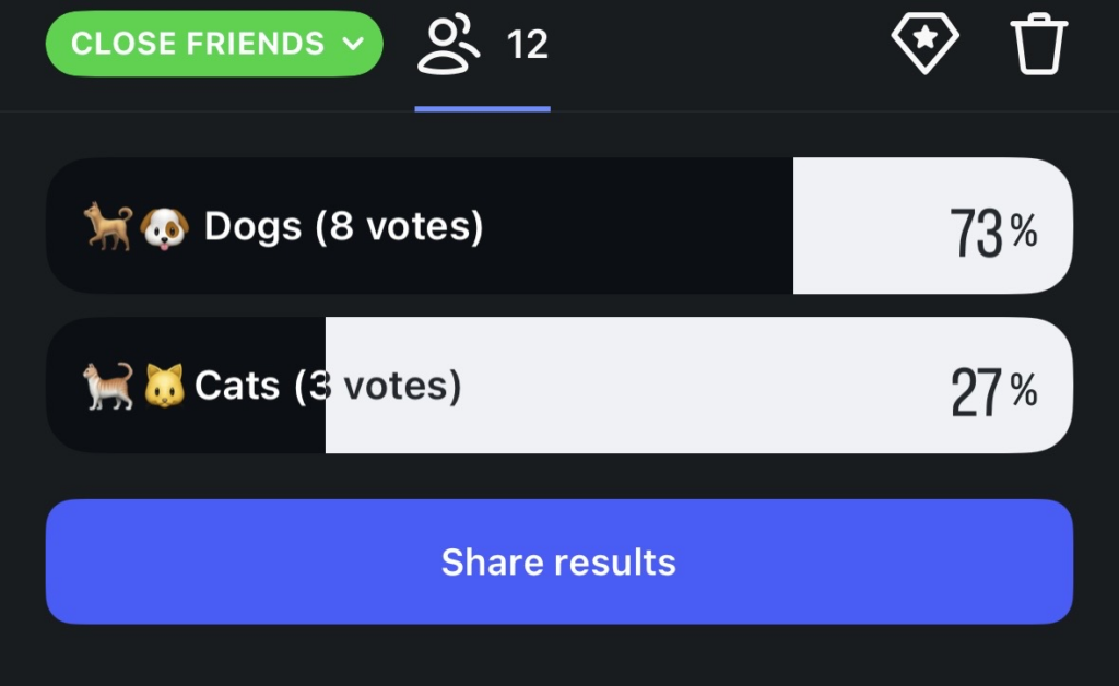
For my second prompt, I thought I would try another way to gather data. I created a Instagram story and used the close friends setting so that a few of my closer friends would be able to view it and vote on the poll. For the question I asked them to pick whether they thought dogs or cats were better.
It was interesting to see different ways for gathering and presenting information online. I was also surprised how easy both of these prompts were to figure out as it wasn’t something I had made/used before.
As Kat Holmes said in her book Mismatch: How Inclusion Shapes Design “Disability is a mismatch between a person’s abilities and their environment” (Holmes, 2018). I think this relates to data visualization in education as it can help us give students a say in their learning needs. As a future teacher, I think it would be beneficial to have students complete a survey like a google form that prompts them with questions about their learning ad what they may need to succeed throughout the year. I also think it is really great that the surveys can be done anonymous as well so students can speak freely without feeling embarrassed if they are shy or have not gotten used to their teachers yet.